ExpertFlyer Marketing Pages
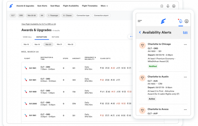
The brand: ExpertFlyer is an online service created to make air travel information easily accessible and for anyone who wants or needs access. It gives users the power and resources of an OTA (online travel agent). Its services include award and upgrade availability, flight availability, travel information like gate times and fare requirements, seat maps and seat alerts, and allows you to set custom alerts when certain fares become available or schedules change.
The ask: Create updated marketing pages to be launched with the updated beta experience, which is aimed at acquiring new audiences beyond just the expert users it originally catered to. Pages include:
- Homepage
- Sign up
- Features & Pricing
- Contact us
- Gift Card
- Help Center
The solves:
Homepage: The goal of the updated homepage was to create a fresh face for the site and immediately showcase what the service has to offer. Additionally, the audience was broadened from an expert flyer (ha) audience to include believers and other interested parties who wanted to fly smartly. The new design incorporates screen grabs from the paid-for premium product and refreshed, smart content created by my content design partner. From the original site (last image in the carousel below), I kept the media mentions and testimonials, and I added data about our usage to help create brand trust. Beyond that, I revamped the page to be feature-first and clean. The goal is to grab attention with the visuals of the product, sell the power of the product, and then funnel potentials into the free trial. To this end, on scroll, there is a sticky banner on the top of the page with a persistent “Start trial” CTA.
For this task, I started with a sketch, moved to wireframes, explored in high-fidelity, and then finalized, all while sharing and requesting feedback.


Sign up: Explored multiple iterations of a new sign-up flow, and created a final flow with an emphasis on ease of use and a reduced barrier to entry in collaboration with a content designer and input from engineering. This new flow simplified the existing multi-step, multi-option sign-up flow from the live ExpertFlyer (which had a separate sign-up flow for each type of subscription—free, premium, basic—and different options depending on if users wanted to pay now or start their free trial), and reduced the flow to a single sign-up screen with clear pathways.
Early iterations of the design in the wireframe stage had a heavy focus on reducing the number of fields before a user could click sign up to the bare minimum, with a heavier burden of choice after that initial click. The second main goal of the first flow was to encourage users to sign up for the free trial. All users are given a one-time 5-day free trial (that they could use at any point) of the premium version. The request from senior leadership was to increase the number of users going through that flow to increase our conversions. So, in the wireframes, after verifying their email for security purposes, on their first return to the site they would be prompted to continue to the free trial as the primary CTA, with a secondary CTA to continue to the free seat alerts account. Not included in these files is that if they continue to the free version, there would be a dismissable sticky banner encouraging them to try the free trial with a CTA that would open a modal with more information. Additionally, if they do use the free trial, there would be a countdown banner with a prompt to pay to keep the premium version.
After an initial share with developers and the VP, we determined this put too much of a burden on the users, and I pivoted to a more streamlined flow that you see pictured first below where users choose from premium and free from the start (note: I only included key screens). At the end of the carousel below, you will see a few other designs I explored in this stage.


Features & Pricing: In collaboration with a content designer, I created the designs for a minimalist, easily scannable design focused on clearly showing the additional value-add of the premium experience over the free experience. The original features & pricing pages were separated out between free and premium (and basic, which has gone away in the new experience). They were very in-depth with detailed information about each feature. The goal of this project was to make this information more accessible to more broad audiences in an effort to increase subscriptions. The detailed information from the original screens was rehomed into a newly created Help Center.
Much of the original designs I created through sketching, InVision Freehand, and wireframes became the inspiration for the layout of the new homepage. We ended up going very basic on this page in an attempt to make the value of premium over free immediately clear. I created all visuals on this page, including the icon set.


Contact Us & Gift Card: The Contact Us and Gift Card pages were both very straightforward, so I created them without wireframes or sketches. The main goal for these two pages was to update to the new style and reduce extraneous text.


Help Center: The Help Center is a net new design that I proposed for ExpertFlyer. On the old ExpertFlyer site, help information was spread out across pages and across the logged-out and logged-in experiences. Additionally, the largest sources of help information for new users existed in two, large (10+ pages each) PDFs. I worked very closely with a content designer to create a singular hub where all of this information could be stored in an easy to read and easy to navigate format. These pages were some of the last new designs I created for ExpertFlyer, so the majority of the styles I needed were already created—as such, I went directly to high-fidelity wireframes to explore my options.
In my exploration, I was focused on creating a clear hierarchy of information and decreasing the time it took for users to find the answers they needed. As much of ExpertFlyer proper is very data/ information heavy, I wanted the hub page and its child pages to breathe. There is a heavy emphasis on white space and simplicity. As a departure from the rest of the site, I chose to go with an illustration for the main graphic of the hub page (the landing page for the Help Center) to help keep the tone of the pages light. I explored illustrations with a theme of “travel help”: a lifebouy, oxygen masks, and a flight control center, which I ultimately went with. After finalizing the direction of the illustration, I collaborated with an illustrator who took my original flight control center illustration and added a level of polish to it. Otherwise, all designs, including the icon set, were created by me.
Page templates included: the hub (homepage), a search results page, an article page, a glossary, an FAQ, and interactive tables. I also created custom icons.


Related items
ExpertFlyer Beta Site
